Tuesday, December 18, 2012

Artsonia Online Art Gallery

 
A couple of months ago I started the process of photographing student artwork and uploading it onto Artsonia.  With 425 students (this doesn't even include my middle school kids) with several projects a piece, this has equated to literally THOUSANDS of pieces to organize. The cool thing is, Artsonia makes it really easy to organize with their database that keeps a continuous electronic portfolio for each student, publishes an online art gallery for my school, provides a priceless opportunity to instantly share student artwork with families, AND artwork can be printed onto a mug, apron, sketchbook, greeting cards, pretty much whatever you can think of, and Artsonia donates 20% to my art department! I've already raised $35 without even trying.  Do I sound like a commmercial? I would recommend them to any art teacher, and parents as well who want to build a portfolio for their children. 
I am more up to date in Artsonia, so check out our work at www.artsonia.com and search for St. Louis Charter School. And buy something, would ya?

Adjective Monsters in 3rd Grade

In 3rd grade we read the book "If You're A Monster and You Know It" with collages illustrations by Rebecca and Ed Emberly.  So much fun to sing along, students loved it!

We collaged colorful monsters and added painted adjectives to describe the monsters. They got so creative with adding different eyes and horns and tails to their monsters.

The next period, we reviewed what an adjective was, and brainstormed different describing words for our monsters on the board.  Adjectives for each monster were decoratively painted in white.

Scary Monster
Hyper Monster
CooCoo Monster
Creative Monster....love it!

Masks

This is one of my favorite Middle School projects. We use plastic mask forms to make plaster molds of faces. The faces are designed to reflect how the students feel about themselves on the inside, and how they perceive others see them on the outside. They write about their design choices and symbolism in an Artist Statement. The written piece never ceases to impress me, and remind me that these kids are thirsty for an opportunity to express themselves. This project is ongoing throughout the year, so check back for more work!


 After painting students place adjectives on the inside of the mask that explains how they see themselves, and adjectives on the outside that describe how others see them.


Eyes or other images can be added to create interest...


A glossy layer of decopage is added to seal in the magazine pieces and protect the mask. 


The masks are displayed in our lobby, floating from clear fishing line.  The frames display their written reflection about their mask in the form of an Artist Statement.


Thursday, November 1, 2012

Haunted Houses: Architecture Study


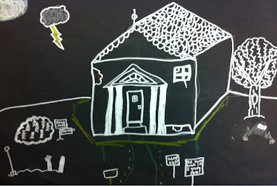
After studying different types of architecture, we designed houses on dark paper, adding pops of color.
To really bring out our lines, we outlined in silver sharpie! Students really liked working with these.
Check out our spooky Haunted Architecture below...

I love all of these windows! Victorian Architecture was the inspiration.
I liked how the ghost seemed sort of cheery in this one.
So minimal! It was the student's idea to add the "fog" rolling in with chalk pastel.
I love his "Y" tree we learned last year.  Notice the Greek columns around the front door.  And who could miss the spooky hand reaching out of the ground!

Monday, October 22, 2012

2012 SLCS Fine Arts Night Video

SLCS Fine Arts Night 
Here is a clip from our Fine Arts Night last year.  It included activities, and artwork from our 900+ kids, grades K-8.  Enjoy!